Showcase of Blocbox
Project

Blocbox

Blocbox is a Software as a Service (SaaS) web application. It aims to provide users with a way to collect, store and share information in a single location.

Tools & Software Used

Google Survey, Google Sheets, draw.io, Balsamiq, Adobe Illustrator, Sketch, UserTesting, UsabilityHub, InVision

End Product

Not Available

The Problem

The creators of Blocbox, designers and other tech professionals, expressed an interest in having one convenient location where they store content for inspiration or for sharing with their coworkers, friends or family. They wanted a quick and easy way to do this that would be accessible across multiple devices.

UX Research

Survey

The first step to understanding Blocbox's potential users and their needs was to send out a survey to members of the web design and development community.

Number of survey respondents: 23

Demographic information, such as age, location and profession, and browsing behaviours gathered from the survey results would be valuable for when compiling user personas and determining important features of the application.

Device Used to Browse Online
Pie Chart: Device Used to Browse Online
  • Smartphone
  • Tablet
  • Laptop
  • Desktop
Save Content While Browsing
Pie Chart: Save Content While Browsing
  • Often
  • Sometimes
  • Never
Write Notes for Later
Pie Chart: Write Notes for Later
  • Often
  • Sometimes
  • Never
Significant Findings & Results
  • A responsive application should be built due to the use of multiple devices for browsing content online
  • Blocbox users will require an easy and convenient way to group saved content as most survey respondents found that a growing list of bookmarks saved in the browser was difficult to manage
  • Provide a simple method for creating and storing notes as most survey respondents keep notes for either business or personal reasons
  • Allowing collaboration with peers will be an important feature as most respondents work in a collaborative environment and often share content with their peers
UX Research

Competitive Analysis

A Competitive Analysis was conducted for Moneta's potential competitors.

Potential competitors:

  1. Evernote
  2. Pocket
  3. Pinterest

By understanding the competition, I was able to discover what Blocbox’s competitors were doing right or wrong and to apply this newly-gained knowledge while designing the application. The analysis also aided me in expanding on the list of potential features that I had not initially considered.

Competitive Analysis Infographic
UX Research

User Personas

Three user personas were created based on demographic information obtained from the results of the user survey distributed earlier. These allowed me to further dive into who Blocbox's potential users are and what their goals and behaviours are.

UX Design

User Stories

Using the business requirements and the information gathered during the user research phase, User Stories were assembled for both new and returning users of Blocbox. Key features of the software were the focus of this task, but "nice-to-have" features were also considered for future updates.

Examples

"As a new user, I want to create an account using my Facebook login."

"As a returning user, I want to share an item via email."

UX Design

User Flows

Using the user stories as a reference, user flows were built out, detailing the sequential order of steps a user would take in order to complete a task or set of tasks.

UI Design

Lo-Fidelity & Hi-Fidelity Wireframes

Low-fidelity and high-fidelity wireframes were created to determine effective placement of content for most pages of the application. A few variations of the home page were created and considered, restructuring the order in which content was presented.

Perspective View of Wireframes
Branding & Identity

Creating a Brand & Identity

The creators of Blocbox wanted the design of the application to exude a professional, yet playful vibe. This was an important detail to keep in mind while developing Blocbox's brand.

Using the logo and branding goal in mind, a style guide was put together that detailed typography options for various levels of headings and for body text, and a complementary colour scheme was chosen.

Style Guide
Logo Variations
  • Blocbox Logo for Light Backgrounds
  • Blocbox Logo for Coloured Backgrounds
Primary Colour Palette
  • #161A5B
  • #3A3FA7
  • #6D73F4
  • #F4D03F
Headings
  • Roboto Slab Regular
Body Text
  • Open Sans Regular
UI Design

Design Mock-Ups

Design mock-ups were created using the high-fidelity wireframes that were created earlier as a jumping off point and applying the selected colour palette and typography.

Perspective View of Design Mock-Ups
User Testing

Remote User Testing

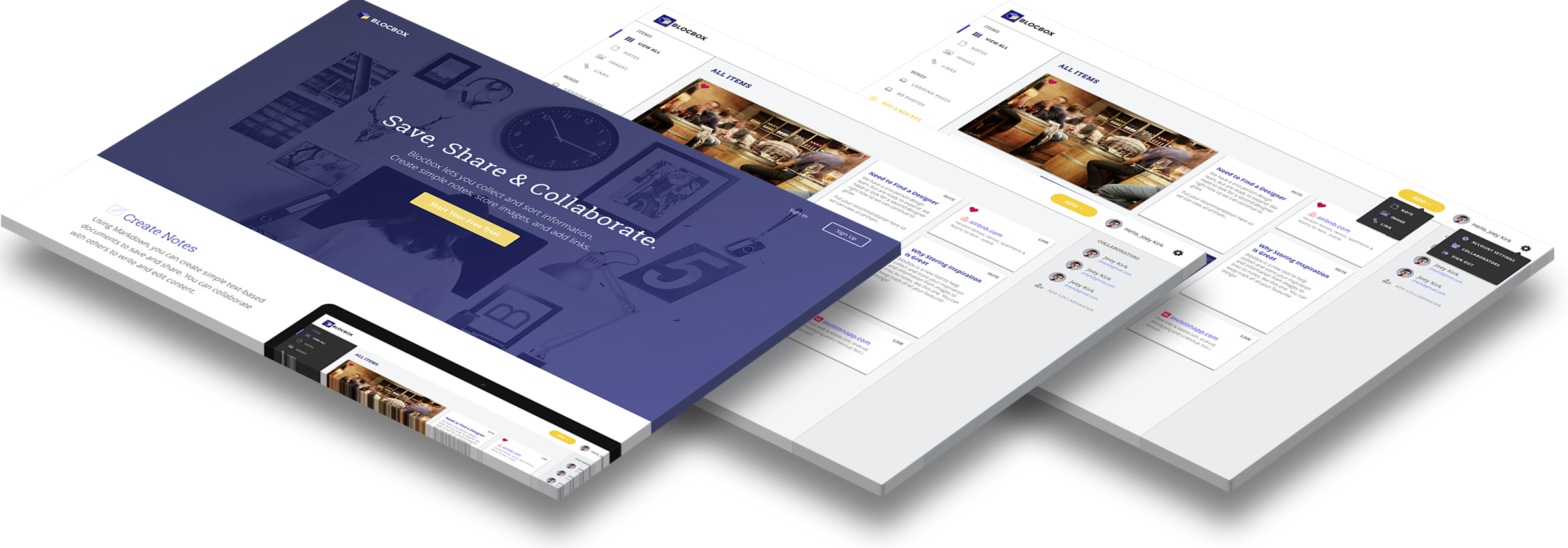
Multiple forms of user testing were performed over the course of the design process.

Remote and One-On-One Usability Testing:
Testers were presented with a clickable prototype of Blocbox. Listening to them speak about their initial impression of the design and as they navigated through the application was an eye-opening experience. The suggestions provided by each tester were insightful and listening to any frustrations they encountered were extremely helpful in determining how to improve the application's functionality.

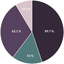
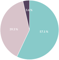
Preference Test:
A Preference Test was distributed to designers and other tech professionals to determine the style of the "Add" button used to add content from the user's dashboard.

Results: A total of 15 people responded and 13/15 testers preferred the gold "Add" button over the "+" icon.

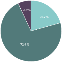
Nav Flow Test:
A Nav Flow Test was distributed in order to determine if it was clear to users how to add content from their dashboard. More specifically, testers were asked to add a note.

Results: Of the 11 respondents, 73% were able to successfully add a note to the dashboard. It appears that some testers attempted to filter the content on their dashboard by notes first before adding one, which would still make this test successful.

Sample from One-On-One Usability Testing Script

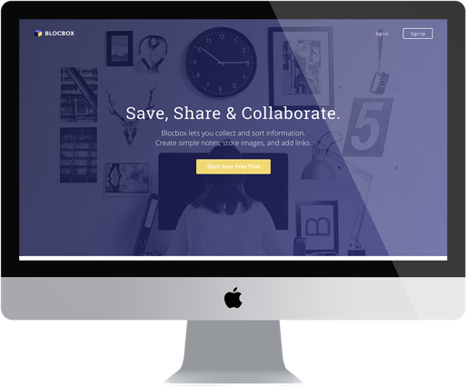
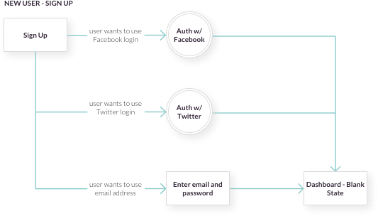
"First, please sign up for Blocbox. As you complete this task, remember to say what you're looking at, what you're trying to do and what you're thinking."

Action: Allow the user to proceed until you don't feel like it's producing any value or the user becomes frustrated.

Test Instructions: Preference Test for "Add" Button

"Which presentation of the yellow 'Add' button/icon in the header do you prefer?"

Yellow Add Button

vs.

Yellow Plus Icon
Test Instructions: Nav Flow

"How would you add a note to this dashboard?"

Conclusion

The complementary colour palette of violet-blue and gold was a bit difficult to work with; more specifically, the gold. There were conflicting opinions from testers and other design professionals as to whether or not the gold call-to-action had a high enough contrast compared to other elements on the page.

User testing and feedback was a considerably vital part of the design process. After all, those are the people you are building the product for, not yourself. Approaches to the design may not have even been considered if it weren't for the insightful feedback of Blocbox's potential users.