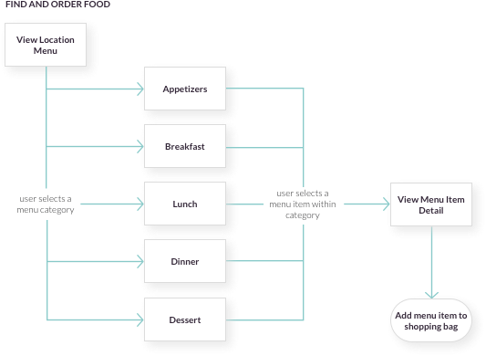
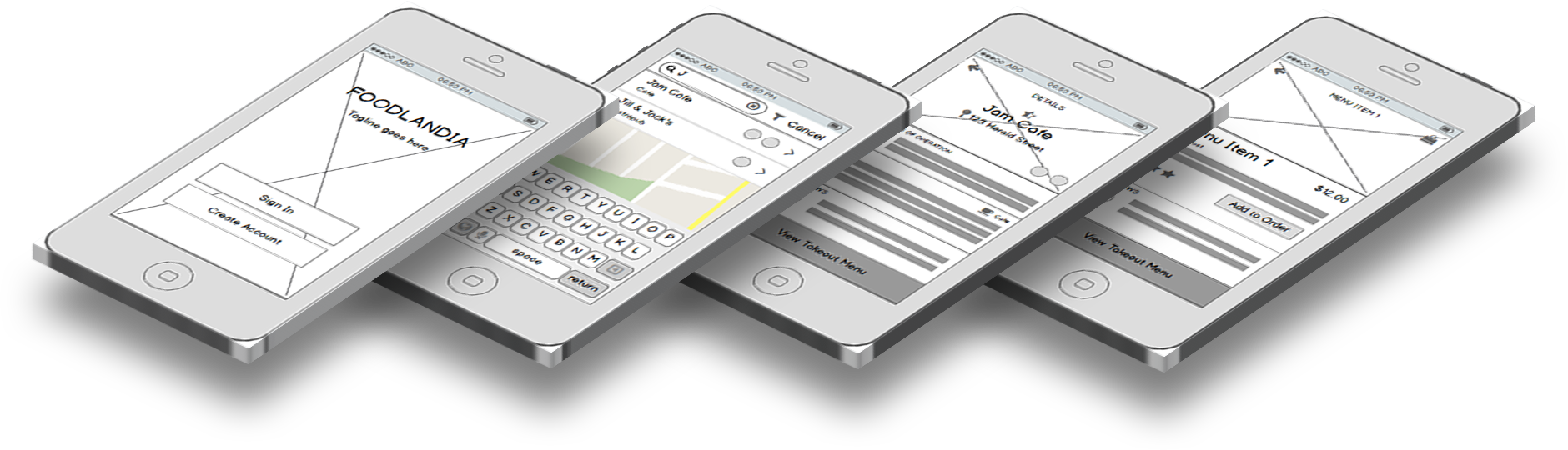
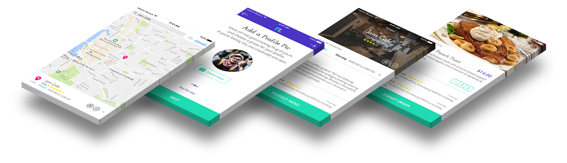
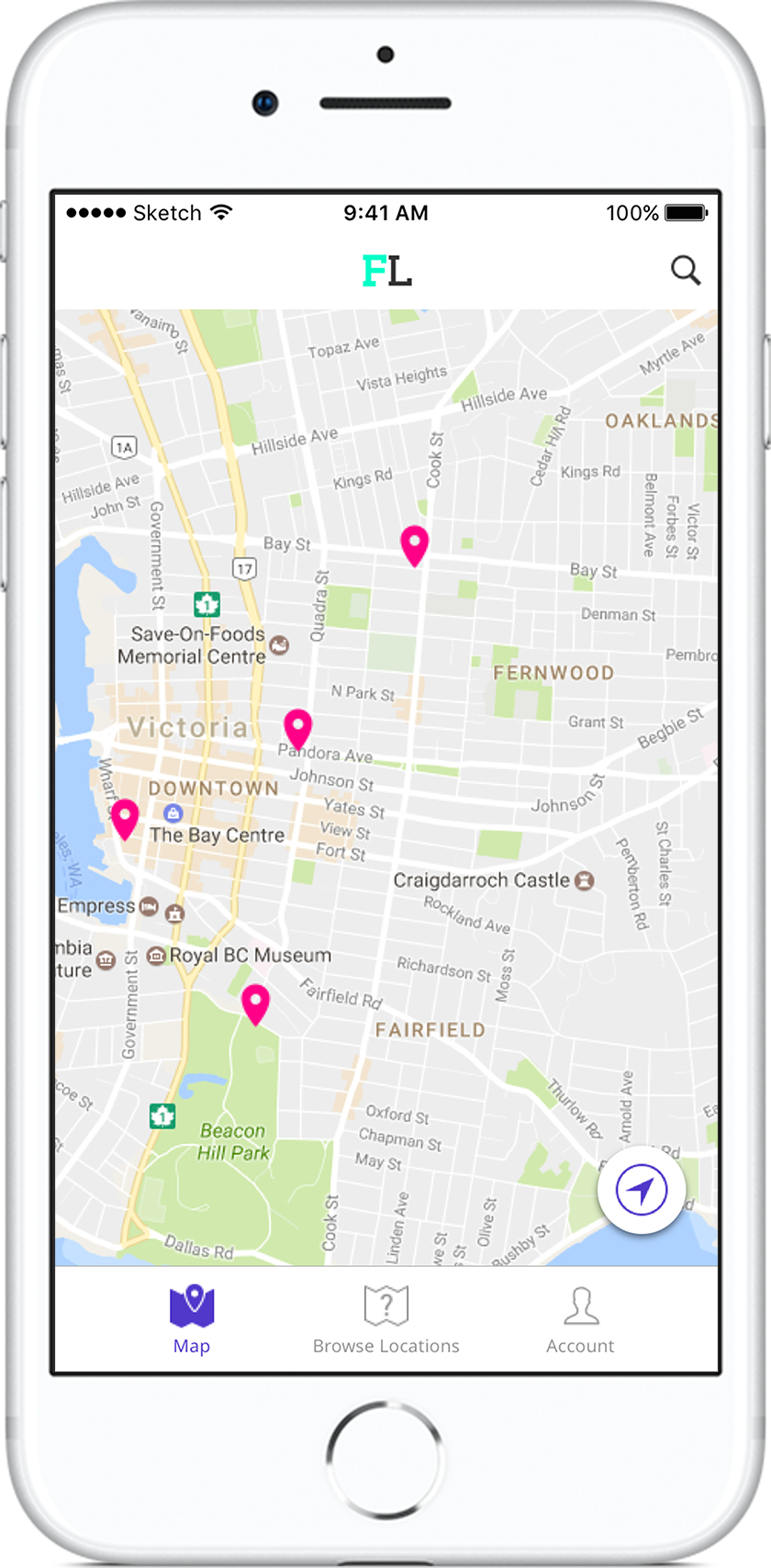
Device Showcase of Foodlandia
Project

Foodlandia

Foodlandia is an iPhone application, designed using the iOS Human Interface Guidelines, that allows the hippest of foodies to locate, order and purchase take-out from their local food joints.

The Problem

When searching for a place to eat, it can take a considerable amount of time and effort to sift through the various restaurants in your area, using an application such as Google Maps, to find something that suits your tastes. Foodlandia was created to help foodies locate, order and purchase take-out from their local food joints and that fit with the hipster culture.

UX Design

User Stories

User stories were pre-determined in the business use case and were vital in creating the necessary user flows for the application.

Examples

“As a user, I want to view food joints near me on a map.”

“As a user, I want to select a food joint, view its’ details and see a menu.”

“As a user, I want to create an account and view recent transactions.”

“As a user, I want to choose items to purchase and pay for them using my iPhone.”

“As a user, I want to rate and review a food joint, and view other ratings and reviews.”

UX Design

User Flows

Using the user stories as a reference, user flows were built out, detailing the sequential order of steps a user would take in order to complete a task or set of tasks.

UI Design

Lo-Fidelity Wireframes

Low-fidelity wireframes were created for processes determined during the building of the user flows and were used to ensure effective placement of content and usability for each screen in the application. This step was especially important in determining an effective approach for processing payments during checkout.

Perspective View of Wireframes
Branding & Identity

Creating a Brand & Identity

The name "Foodlandia" was chosen as a nod to hipster culture and was inspired by the television show, Portlandia.

Since the application was built to appeal to foodies of the hipster variety, it was important that it had a fun and slightly-unsual feel to it's brand. A bright colour palette and a fun serif typeface were chosen in order to meet this requirement.

Style Guide
Logo Variations
  • Foodlandia Logo for Light Backgrounds
  • Foodlandia Logo for Coloured Backgrounds
Primary Colour Palette
  • #00FFC6
  • #FFED00
  • #5138CA
  • #FF0086
Headings
  • Josefin Slab Semi-Bold
Body Text
  • Open Sans Regular
UI Design

Design Mock-Ups

Design mock-ups were created using the low-fidelity wireframes that were created earlier as a jumping off point and applying the selected colour palette and typography.

Perspective View of Design Mock-Ups

Check out the Foodlandia prototype!

Conclusion

The creation of the Foodlandia mobile application was intended to be a "just-for-fun" project that would allow me to become familiar with designing an application that abided by the iOS Human Interface Guidelines.

Looking back, I am increasingly aware of some areas that could use improvement, such as in the readability of the heading typeface that was chosen, but overall it was a fun way to explore designing for mobile applications.