Device Showcase of Moneta
Project

Moneta

Wedding spending in North America is on the rise! Did you know the average wedding in America in 2016 cost roughly $35,329? Moneta, a responsive web application that helps engaged couples manage their unique wedding budget, was created in response to this increase it spending.

Tools & Software Used

Google Survey, Google Sheets, Axure RP, Sketch, UserTesting, UsabilityHub, InVision

The Problem

While planning my own wedding back in 2016 I found that the budget tools provided by major players in the wedding industry did not live up to my expectations. These tools prevented me from customizing my budget according to how my fiancé and I saw out wedding day coming together and, frankly, felt like they were designed by someone who didn't understand how to effectively manage a budget.

UX Research

Survey

One of the most important steps in planning to build product is to determine if there is a need for it by your target market. To do this for Moneta, I created and distributed a survey to a large group of people from various backgrounds.

Number of survey respondents: 23

Although there weren’t as many respondents as I had hoped, I did achieve the mixture of demographics that I was looking for to get a more accurate picture of what a potential user’s needs would be.

Overall Result:
Similar to my own experience, the majority of the survey respondents had kept or were currently keeping a wedding budget, but they found they did not have the perfect tool available to them.

Genders
Pie Chart: Female vs. Male Survey Respondents
  • Female
  • Male
Ages
Pie Chart: Age of Survey Respondents
  • 18 to 24
  • 25 to 34
  • 35 to 44
  • 45 to 54
Marital Statuses
Pie Chart: Marital Status of Survey Respondents
  • Engaged
  • Married
  • Neither
Married Individuals
  • 66.7% had maintained a wedding budget
  • Used Excel as primary tool because it was free and customizable
  • Most did not like Excel because it was time consuming to build formulas
Engaged Individuals
  • 100% were maintaining a wedding budget
  • Used Excel as primary tool because it was free and customizable
  • Most did not like Excel because it was time consuming to build formulas
UX Research

Competitive Analysis

A Competitive Analysis was conducted for Moneta's potential competitors.

Potential competitors:

  1. The Knot - desktop wedding budget tool
  2. Wedding Wire - desktop wedding budget tool
  3. Wedding Happy - mobile wedding planning application

Performing this task allowed me to understand and consider what my future competitors were doing well and what they were doing not so well. This was essential in ensuring that Moneta was built into an even greater product then what was currently available to users. The analysis also helped me to expand on the list of nice-to-have features to be added in future versions of the application.

Competitive Analysis Infographic
UX Research

Budget Research & Prior Experience

Before I began my career as a UX/UI & Web Designer, I studied Economics & Finance in University and was employed in a number of Finance-related roles over the course of 5 years. I was even on track to become a Chartered Professional Accountant (CPA) before I made the switch to UX/UI Design. I was able to capitalize on the financial management skills that I built during this time in to put together a list of requirements for features a wedding budget required.

UX Design

User Stories

High-level user stories were created for both new and registered users of Moneta using information gathered during the research phase. These were there further broken down into more detailed user stories which was especially important for ensuring that key budget functionality was not forgotten.

Examples

High-Level

"As a registered user, I want to edit my wedding budget."

Low-Level

"As a registered user, I want to remove a budget category from my wedding budget."

High-Level

"As a registered user, I want to view my dashboard."

Low-Level

"As a registered user, I want to see a monthly snapshot of my spending on my dashboard."

UX Design

User Flows

Using the user stories as a reference, user flows were built out, detailing the sequential order of steps a user would take in order to complete a task or set of tasks.

UI Design

Hi-Fidelity Wireframes

With a considerable amount of user data gathered and user experience design completed, it was time to move on to the actual design of the application, beginning with high-fidelity wireframes.

Perspective View of Wireframes
Branding & Identity

Creating a Brand & Identity

Let's face it, money management isn't exactly something that people get excited about. For this reason it was important that the overall vibe of Moneta was fun and playful, and it should appeal to the application’s target market: men and women in the 18-34 age range.

Choosing a product name:
Moneta (pronounced moh-nay-tah)

In Roman mythology, Moneta was a title that was given to Juno, the Roman goddess of love and marriage. The latin word Moneta is also the source of the English word “money”. This seemed like the perfect combination, and thus, the perfect name, for a wedding budget application.

Style Guide
Logo Variations
  • Moneta Logo for Light Backgrounds
  • Moneta Logo for Coloured Backgrounds
Primary Colour Palette
  • #4D7298
  • #42BBC5
  • #9AEAD4
  • #EDF7F4
Secondary Colour Palette
  • #E17BAC
  • #83437E
Headings
  • Playfair Display Black
  • Montserrat Medium
Body Text
  • Montserrat Light
UI Design

Design Mock-Ups

Design mock-ups were created using the high-fidelity wireframes that were created earlier as a jumping off point and applying the selected colour palette and typography.

Perspective View of Design Mock-Ups
UI Design

Designing the Budget Detail Page

Of all of the pages, it was most important to get the structure of the design for the budget detail correct. It is expected that this page is where the user will spend the majority of their time and it is where they will be entering and editing items within their wedding budget.

It was a challenging task to be able to effectively layout all of the data that the user would need to have access to in a way that was not visually overwhelming and to ensure that functionality was simple and explicit.

Over the course of the design process, the page went through multiple iterations based on user testing results and feedback from the design community.

User Testing

Remote Usability Testing

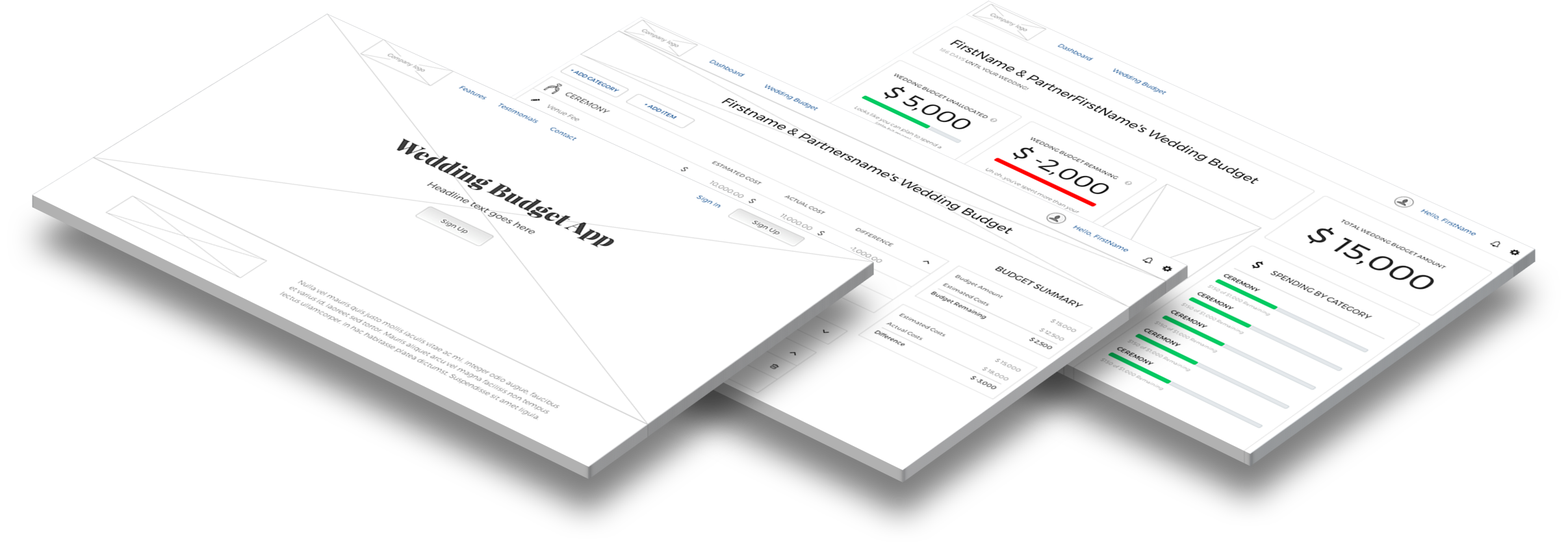
Using InVision, a clickable prototype of the of the design mock-ups was created for the purpose of creating usability tests.

A test plan was created using UserTesting and distributed to testers within the target market age range of 18 to 35. Two user testers went through the test plan: one male and one female.

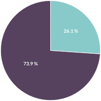
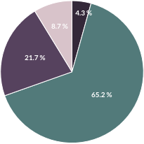
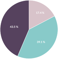
Overall Results:
The overall feedback of the site was extremely positive.

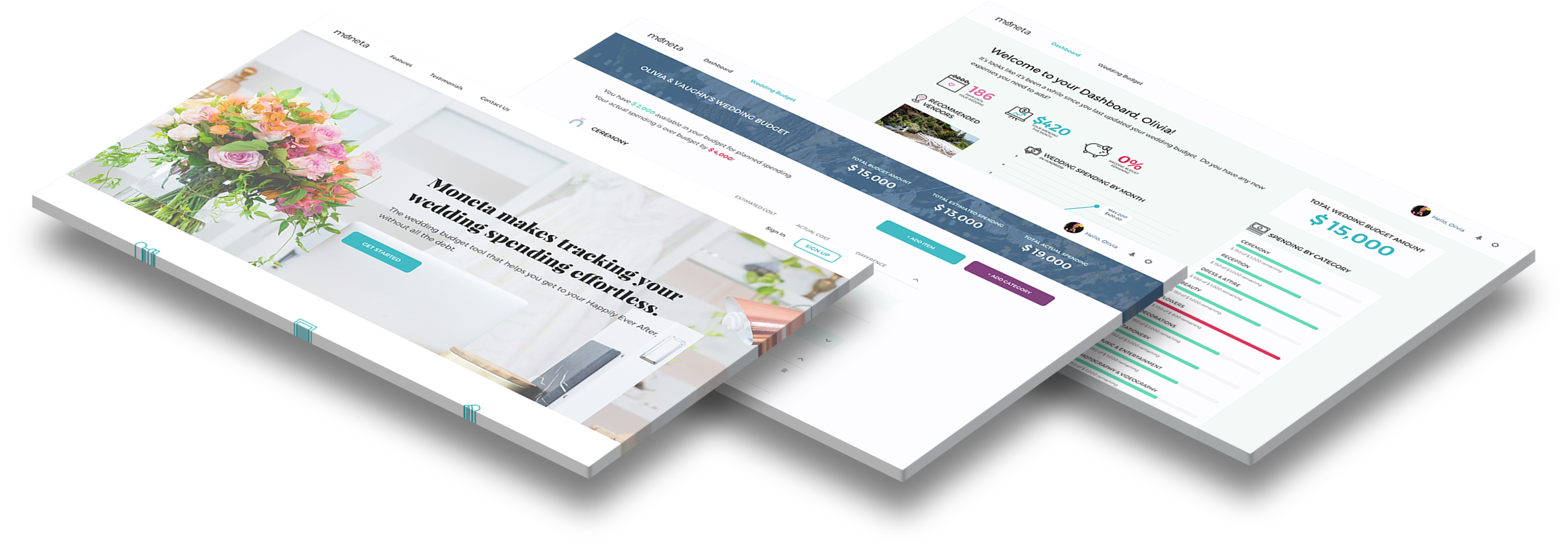
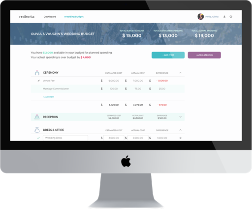
Both testers appreciated that the layout of the site was clean and simple to navigate, especially the budget detail page itself, and that the colour palette and typography fit the target market of the application.

Valuable feedback was given regarding stock photo choices (and whether or not they fit the design of the application) and content that would have been useful on the budget detail page. All of this feedback was considered in revisions of the designs.

Test Plan
Introduction

You're newly engaged and you're browsing the web for tools and websites that will help make the wedding planning process as smooth as possible. You've come across the website for a company called Moneta.

Tasks
  1. Without leaving the homepage, what are your initial impressions of the website? Explain your answer. [Verbal Response]
  2. Sign Up for a new account to create your personal wedding budget.
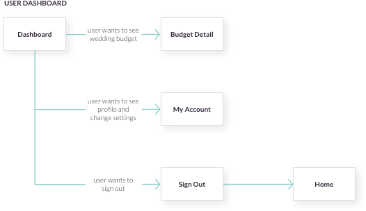
  3. Navigate to the User Dashboard (if you are not already there).
  4. Is the information on this page helpful, valuable or interesting? Explain your answer. [Verbal Response]
  5. Navigate to your Wedding Budget.
  6. What, if anything, do you **like** about the wedding budget page? [Verbal Response]
  7. What, if anything, do you **dislike** about the wedding budget page? [Verbal Response]
Questions
  1. What frustrated you most about this site?
  2. If you had a magic wand, how would you improve this site?
  3. What did you like about the site?
  4. How likely are you to recommend this site to a friend or colleague (0=Not at all likely, and 10=Very Likely)?

Check out a video on the Moneta prototype in action!

Conclusion

Overall, I am extremely proud of the end result of this project. As this was an idea that I have had for a couple of years now, it was amazing to see the design come to fruition after all the time and effort that was putting into designing it.

What was incredible to me was the response to not only the design of the application, but the actual want and need of it. It made me truly understand the value of conducting user research and of receiving feedback from user testers and members of the design community. Because of these things, I believe that Moneta will be an even better wedding budget tool than I had initially planned.